Comprehensive Information Design
Where functionality and aesthetics are equally important to drive intuitive and actionable insights to empower others through knowledge.

Tactical Preparation
Understanding the scope of work as well as preparing a strong foundation for the data so it's fit for any future data projects.
Impactful Visualizations
Presenting information in any format that allows for the greatest amount of understanding and ease of use.
Intuitive Insights
Building reports, dashboards, and other formats to always have the access to intuitive insights at any time.
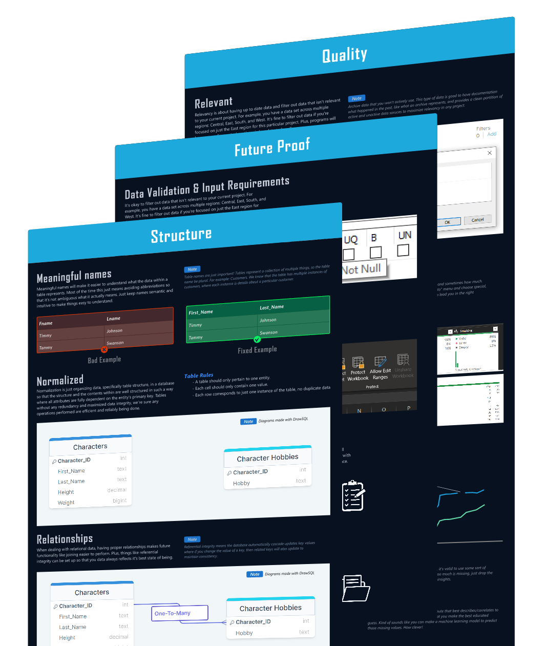
Tableau
Excel
Python
General Designs
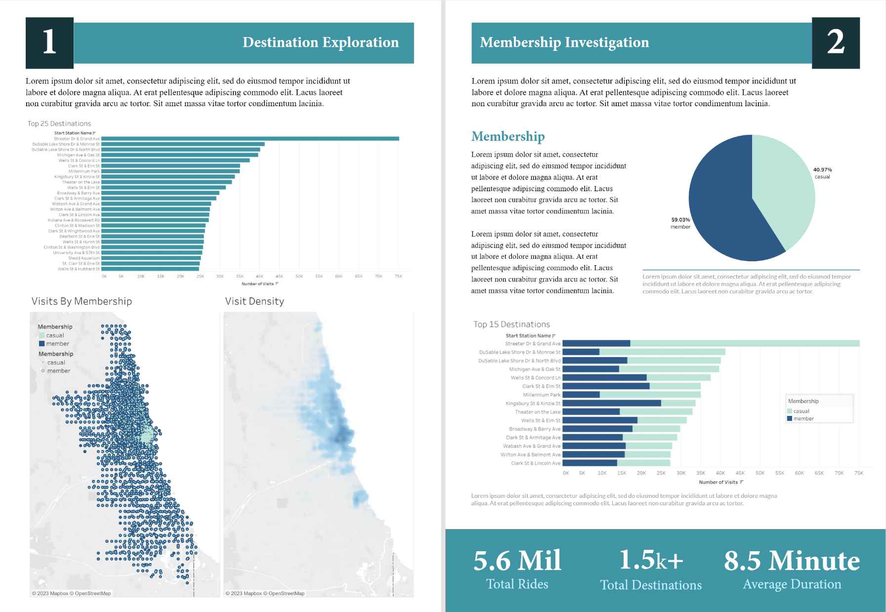
Google Report
My Google Data Analytics certification final project challenged convention. Instead of a standard dashboard, I ventured into an different approach by crafting a design reminiscent of a book report to explore the unique approach to data analysis and storytelling.
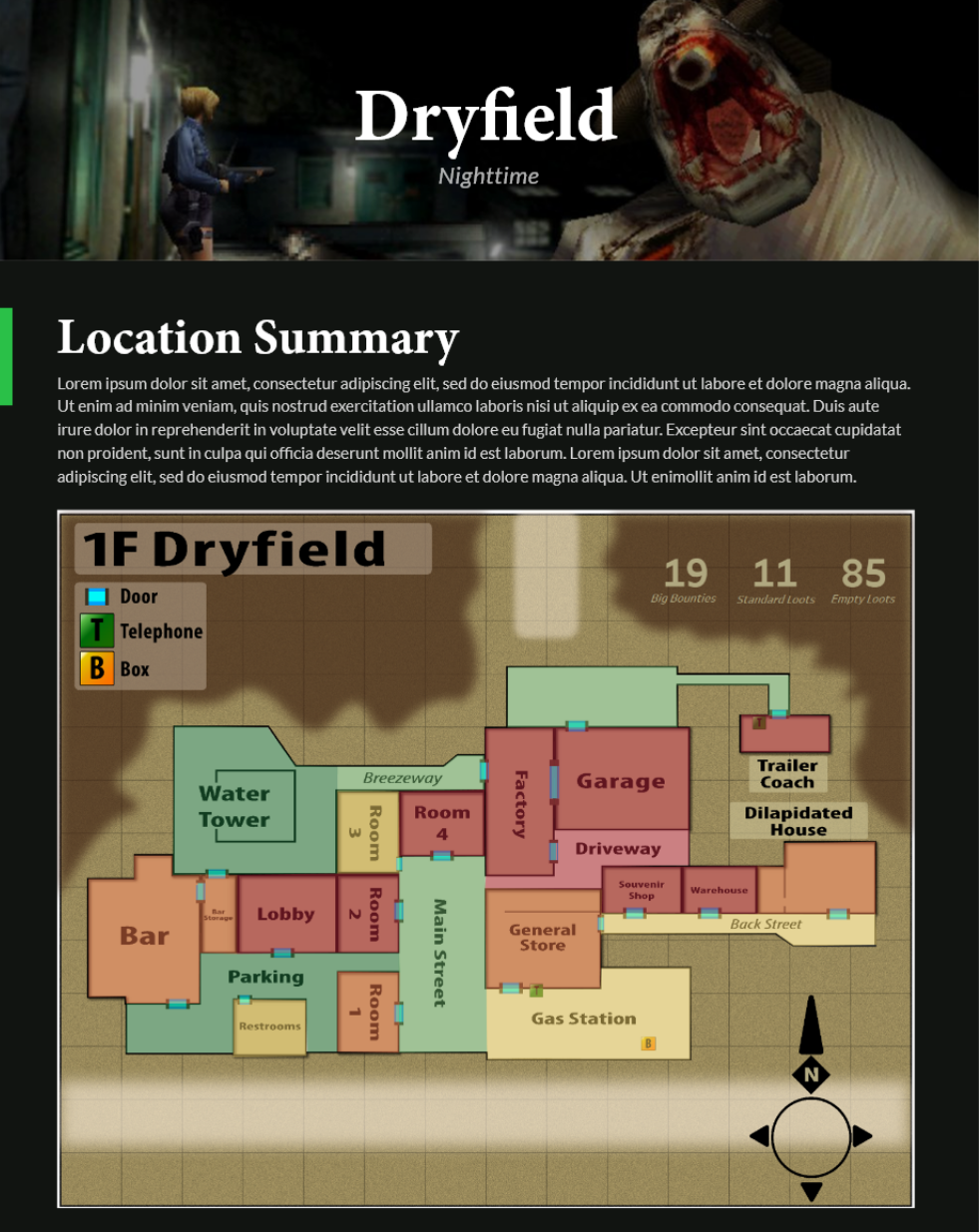
Game Report
This is an almost entirely from-scratch endeavor, from meticulous manual research and data entry into a tailored database to the complete re-mastery of a retro game map using Illustrator. The culmination unveils never-before-seen new facets of a game I thought I and many others knew inside out.
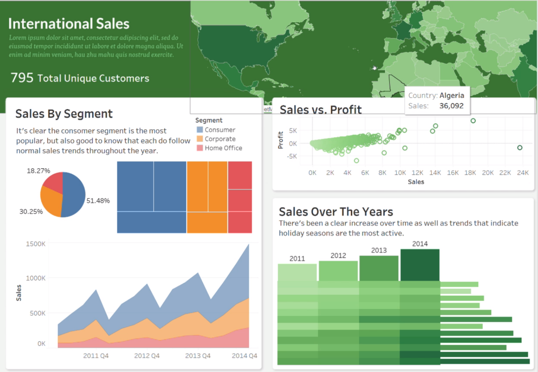
International Sales
An experimental take on report/dashboard hybrid design. What stands out is the interactive banner at the top, doubling as a functional map. Hover your cursor to unlock additional insights in this international sales and visualization, making data exploration engaging and informative.
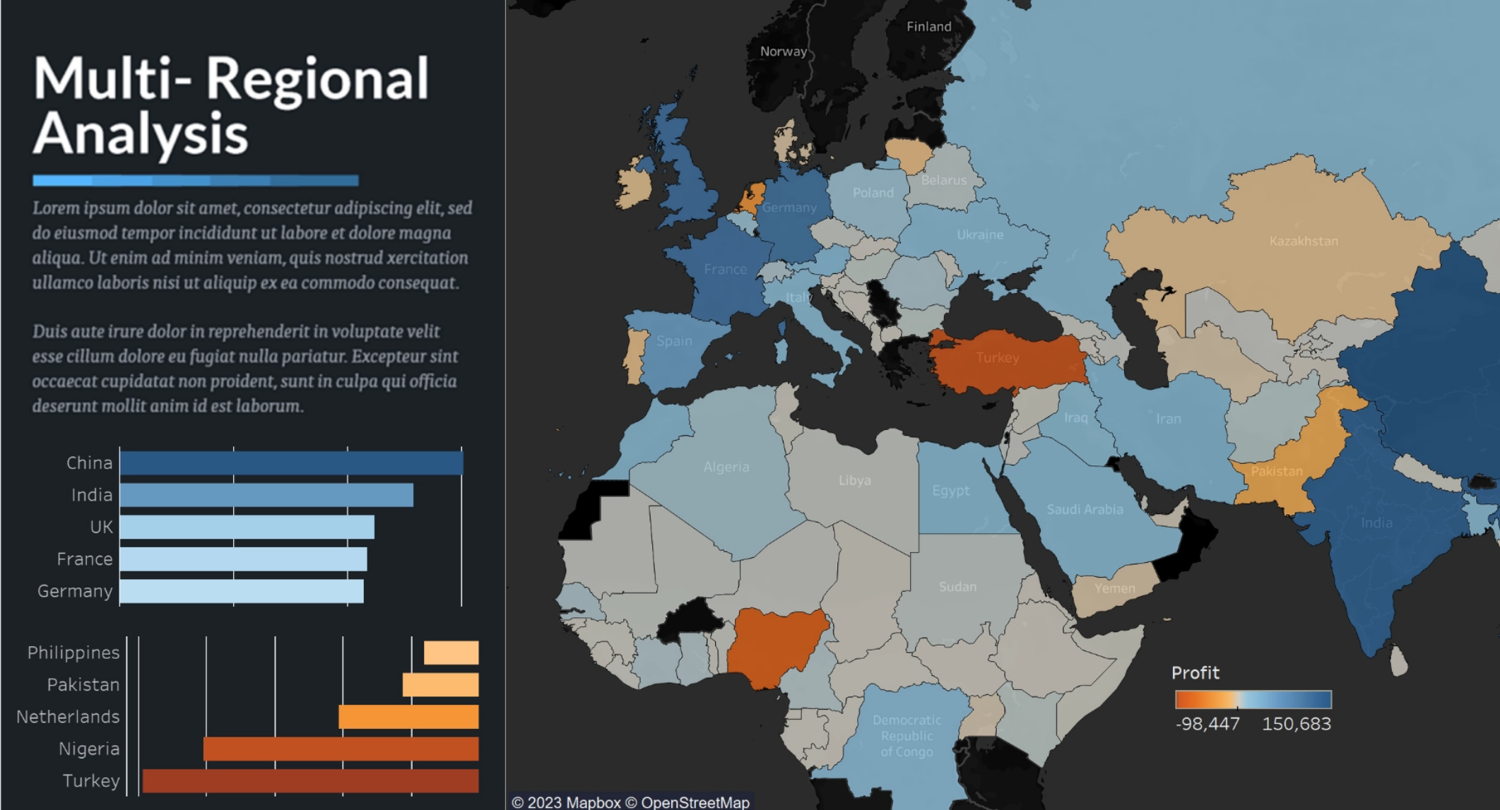
Regional Analysis
Take a look at this regional profitability with this Tableau map and bar chart combo. A unique narrative style offers a fresh perspective, making data engaging and easy to digest. The custom design adds a touch of sophistication to this sleek presentation.
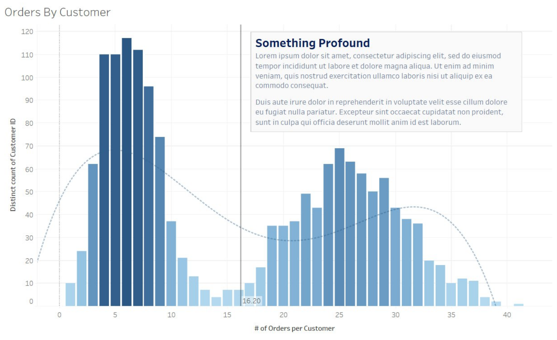
LOD Analysis
This was an example I made for my Tableau certification practice, so sadly I can't share the example. However, this demonstrates many advanced topics like LOD, data format changing to utilize certain features, as well as a simple design to show off a lot of information at once.
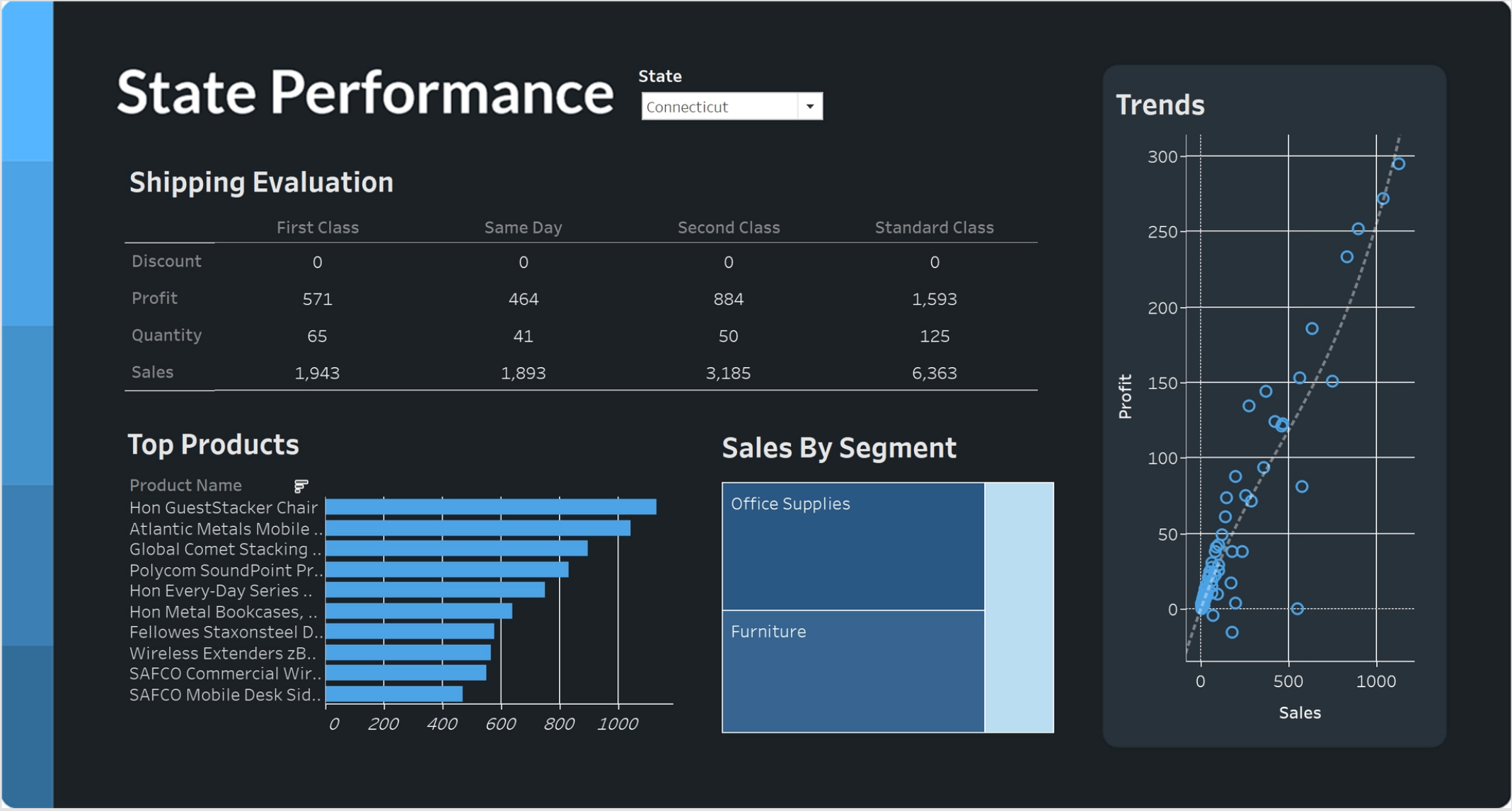
State Analysis
An intriguing blend of data card and dashboard elements, this design harmonizes extensive information while maintaining a sleek and lightweight feel. Enhanced by a captivating monochromatic palette, it's not just informative but also visually delightful.
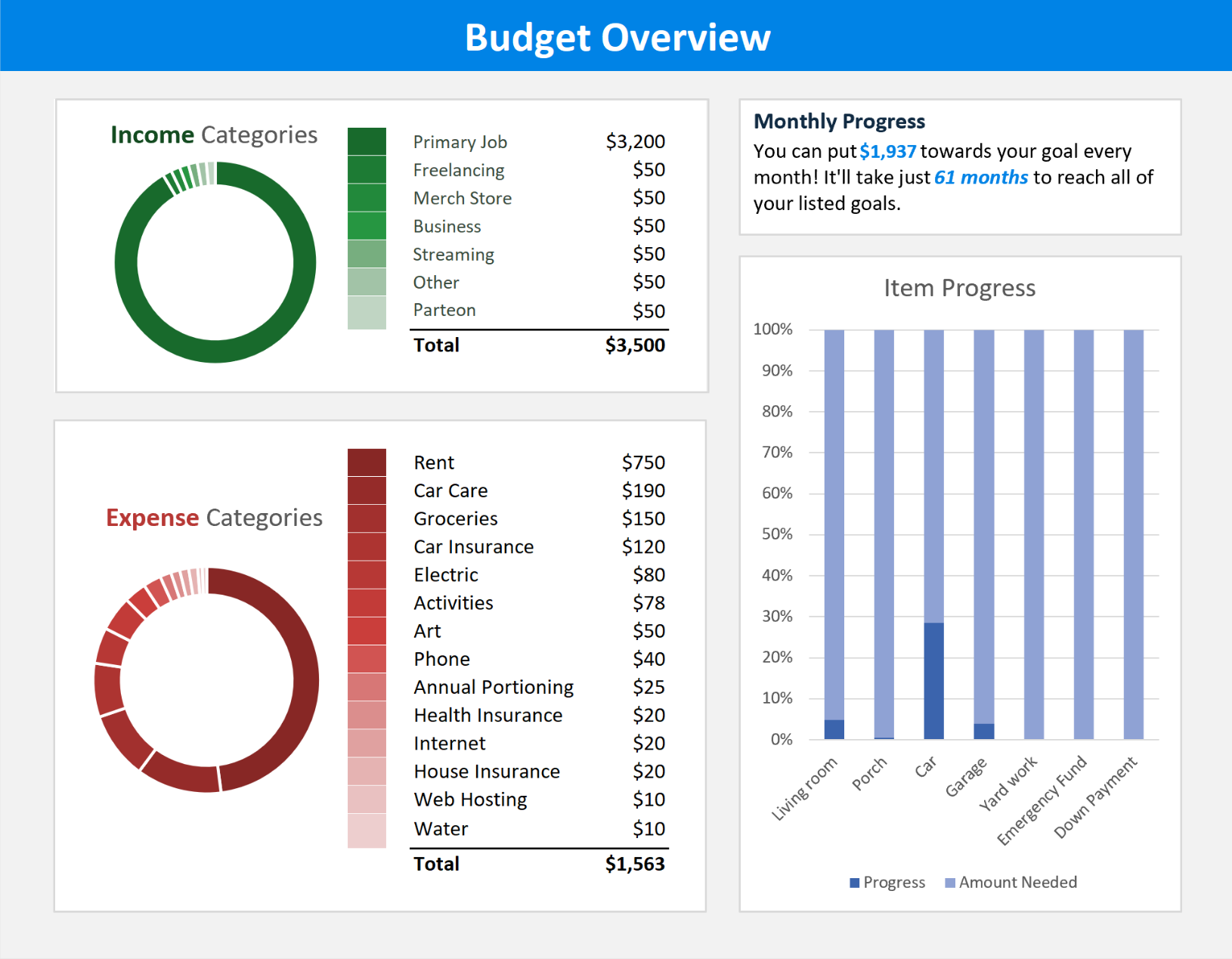
Personal Budget
Straightforward yet valuable, this budget dashboard simplifies cash flow and provides a clear visual of how you can allocate remaining funds toward monthly goals. Easily track your financial progress and stay on top of your financial aspirations.
Activity Report
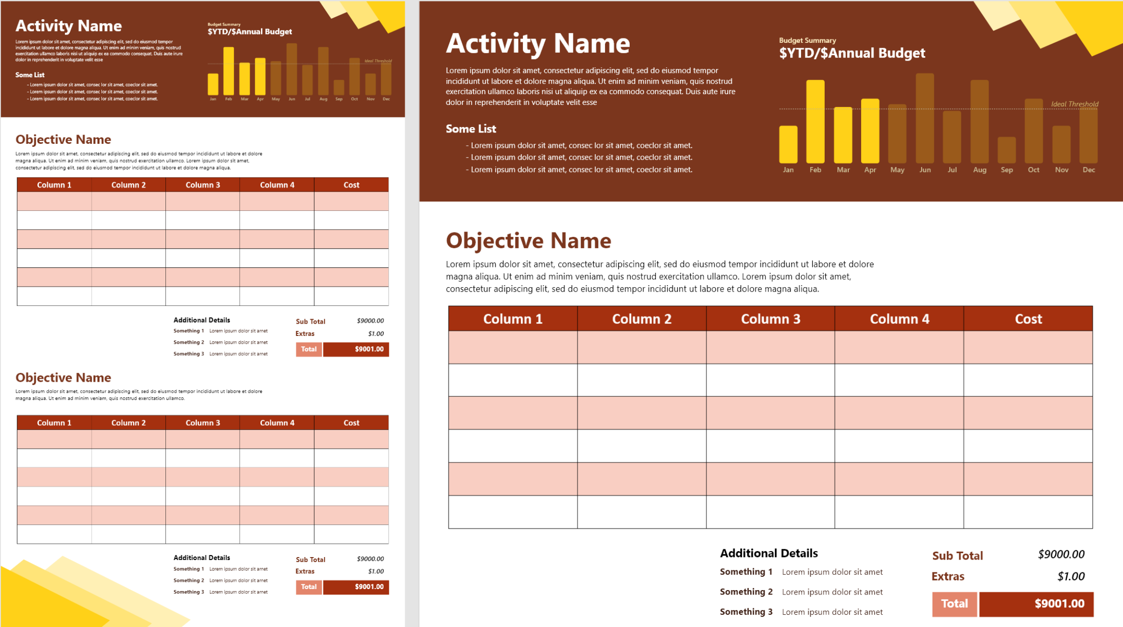
A thematic template report tailored made for a university's activities. The captivating header integrates a sleek design, complete with an intuitive bar chart for a quick year-long budget overview. This versatile template efficiently captures goals, activities, and financial tracking for the year.
Geocard
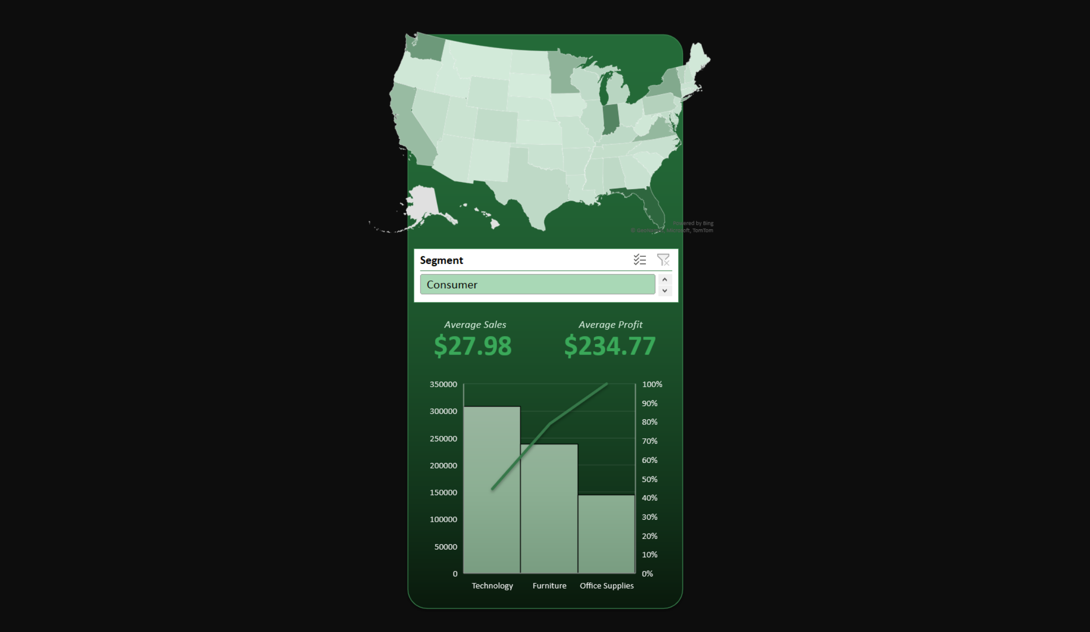
An elegant data card that distills essential profit and sales metrics, shedding light on both overall performance and the specific merchandising segment. This compact gem provides a comprehensive snapshot of your geographic data, making it a valuable asset in your analytical toolkit for regional analysis.
Event Budget
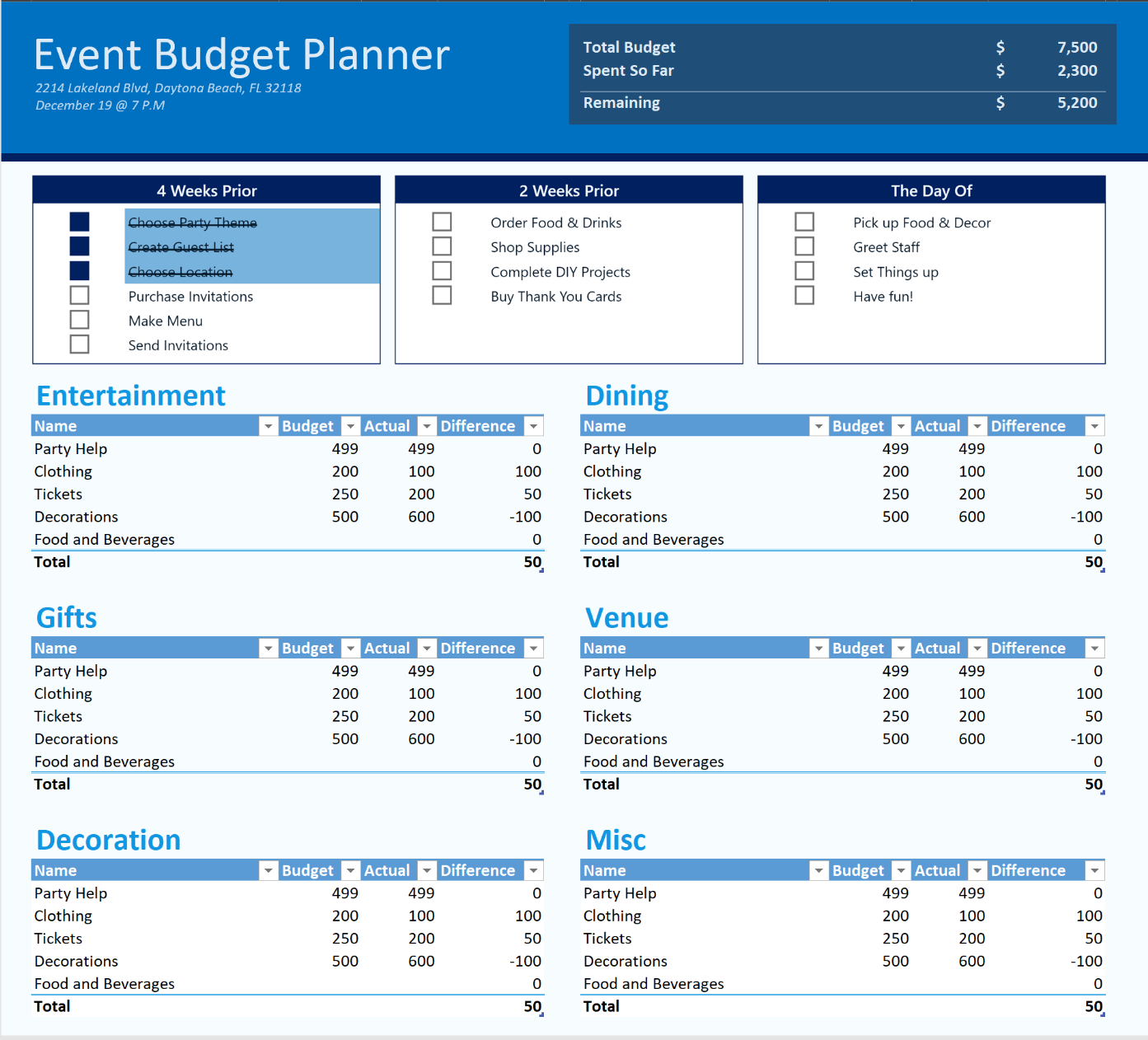
A streamlined event budget summary sheet, thoughtfully organized into categories for easy reference. Stay in control of your project with a handy checklist at the top, ensuring all essential elements are in one centralized location, simplifying your event planning process.
Performance Dashboard
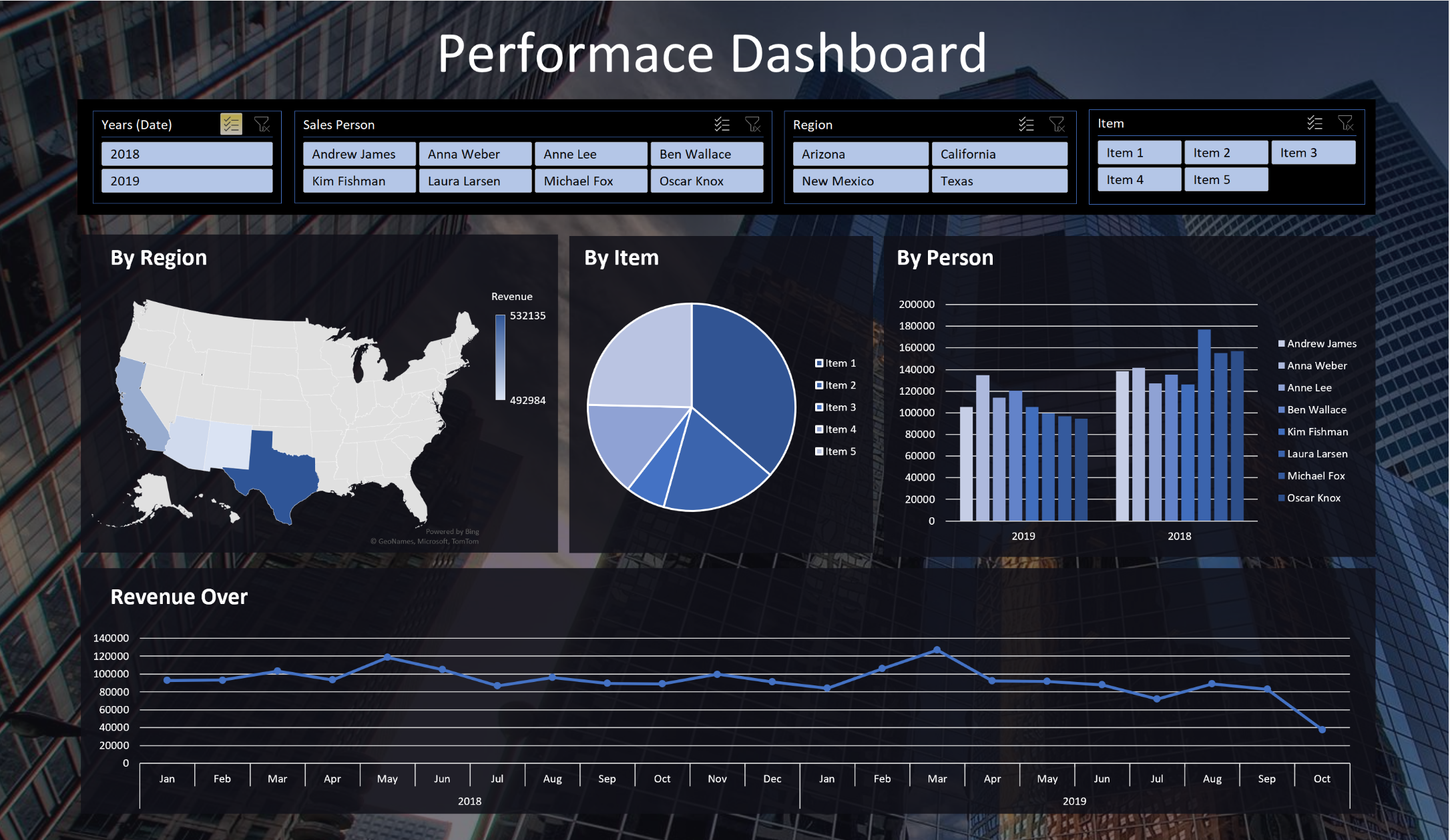
Explore an exquisite dashboard designed to provide straightforward yet insightful regional data. Leveraging background images, transparent shapes, and floating charts in Excel, this design demonstrates the remarkable potential within Excel's capabilities.
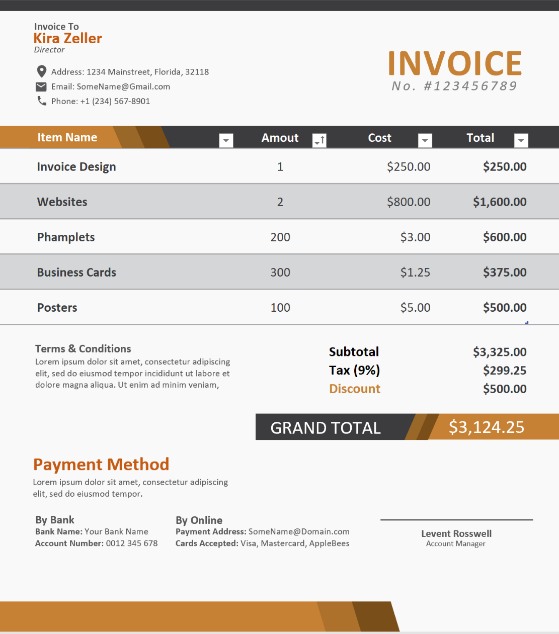
Invoice
An invoice design that oozes elegance, sporting a sleek black and orange color scheme. A testament to the power of design knowledge and Excel's capabilities, it appears deceptively simple but involves intricate work with custom shapes, text boxes, and layering. The result speaks for itself, a polished and professional invoice that defies its Excel origins.
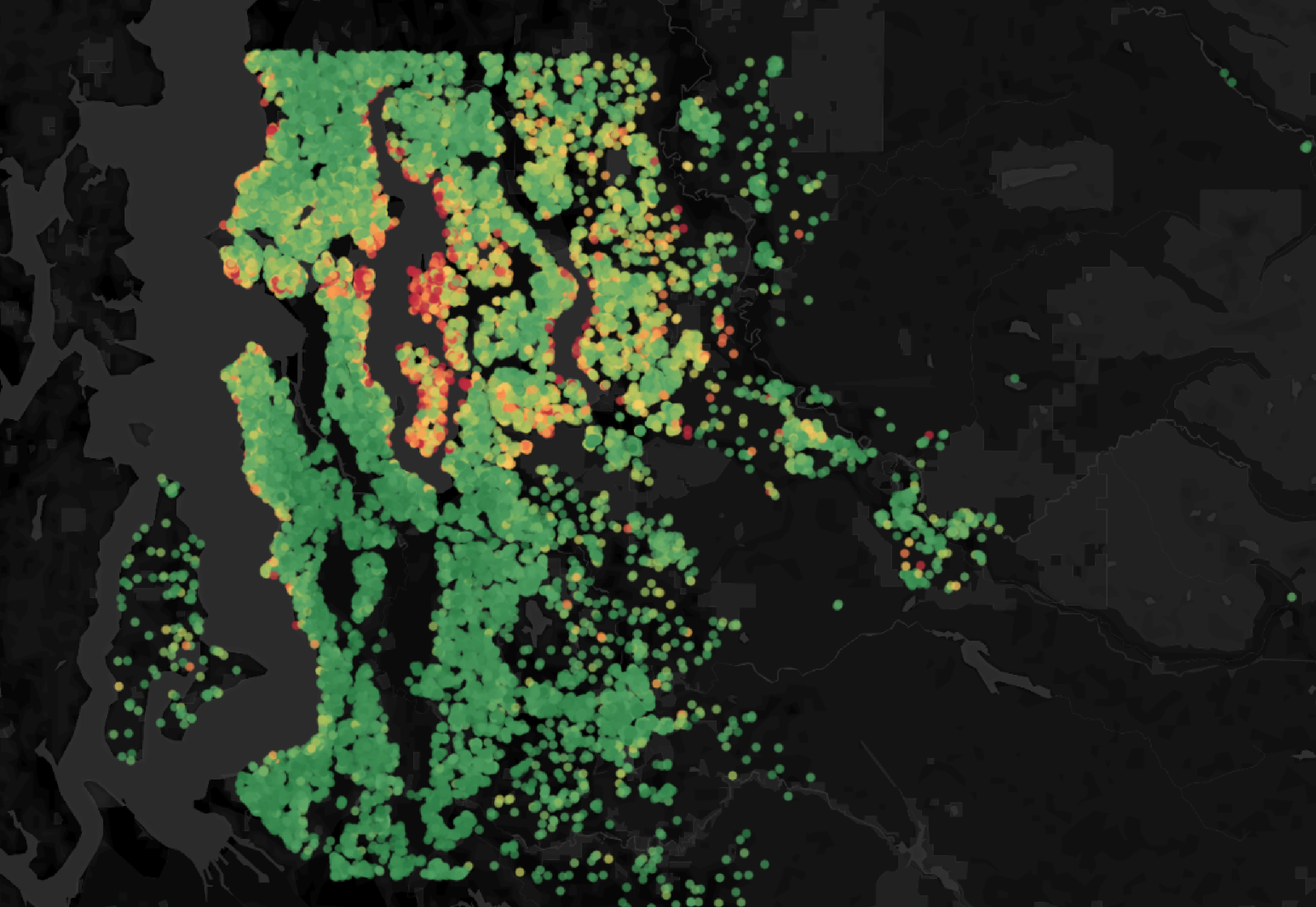
House ML
Delve into the complete journey of creating a regression-based model to predict housing prices in this Kaggle notebook. Through meticulous data preparation and systematic analysis, I crafted a model that achieved an impressive 88% accuracy, showcasing the power of data-driven insights in the realm of real estate forecasting.
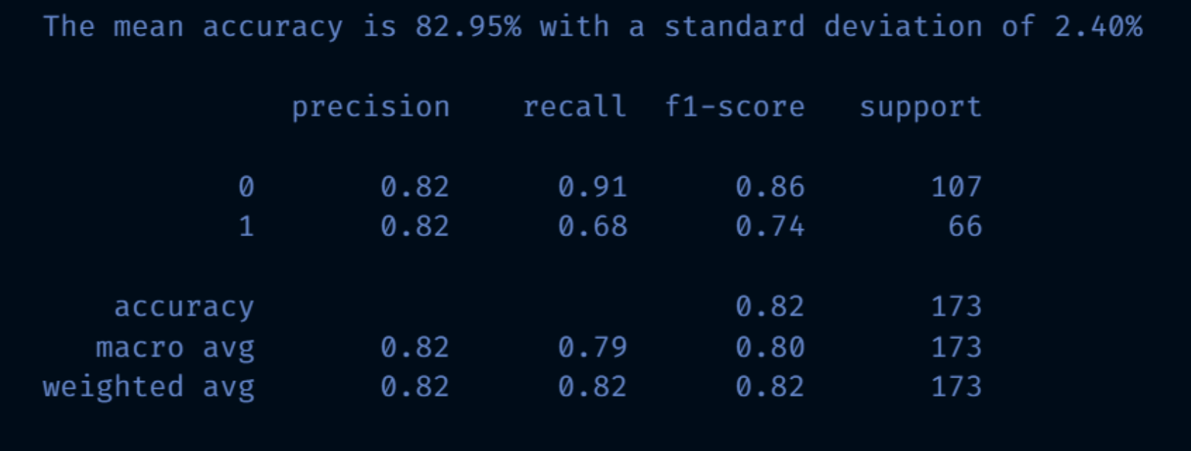
Titanic Survival
Exploring the iconic Titanic dataset to predict survival rates, I prioritized data cleanliness and performed extensive feature engineering. The focus was on extracting meaningful insights for both users and the model, elevating the accuracy and understanding of this classic data challenge.
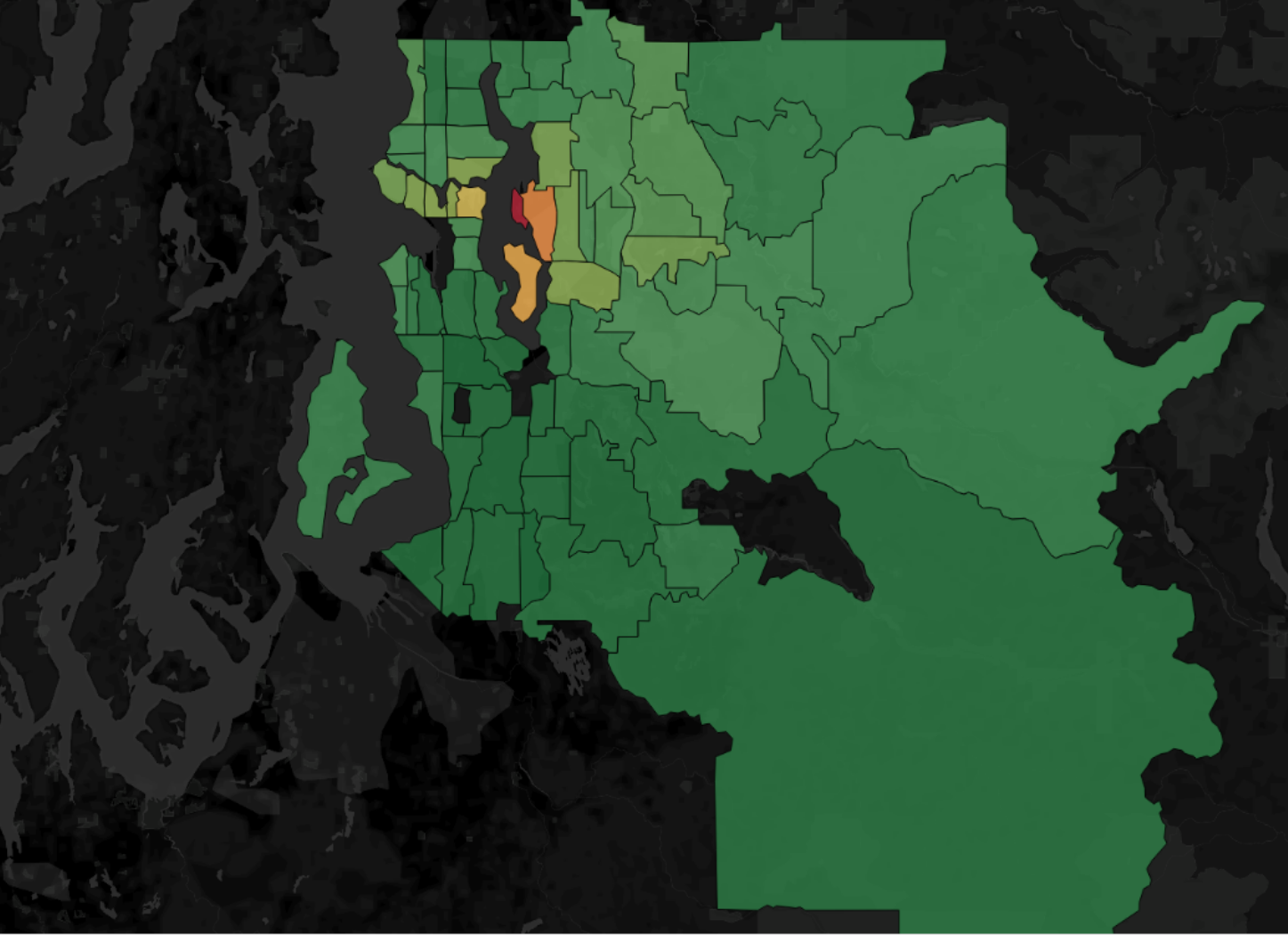
House Model NN
Exploring the iconic Titanic dataset to predict survival rates, I prioritized data cleanliness and performed extensive feature engineering. The focus was on extracting meaningful insights for both users and the model, elevating the accuracy and understanding of this classic data challenge.
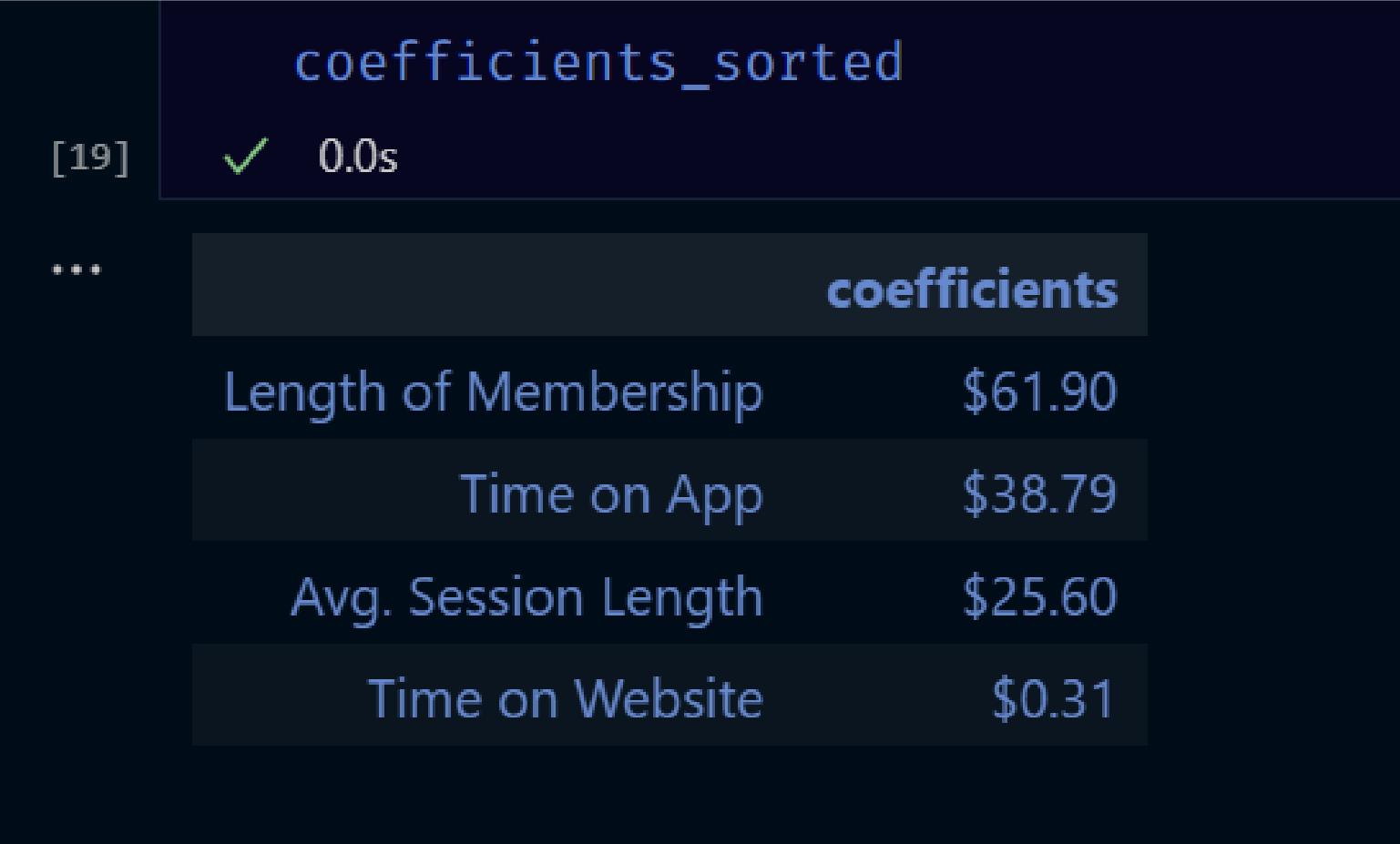
Ecommerce Regression
Exploring the iconic Titanic dataset to predict survival rates, I prioritized data cleanliness and performed extensive feature engineering. The focus was on extracting meaningful insights for both users and the model, elevating the accuracy and understanding of this classic data challenge.
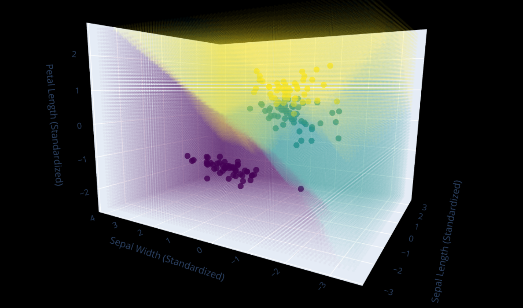
Decision Boundary
Though the Iris dataset is relatively straightforward, my quest for innovation led me to explore rarely seen horizons. In this project, I ventured into the world of 3D decision boundaries, offering a fresh and captivating perspective on this iconic dataset, pushing the boundaries of data visualization with unique applications.
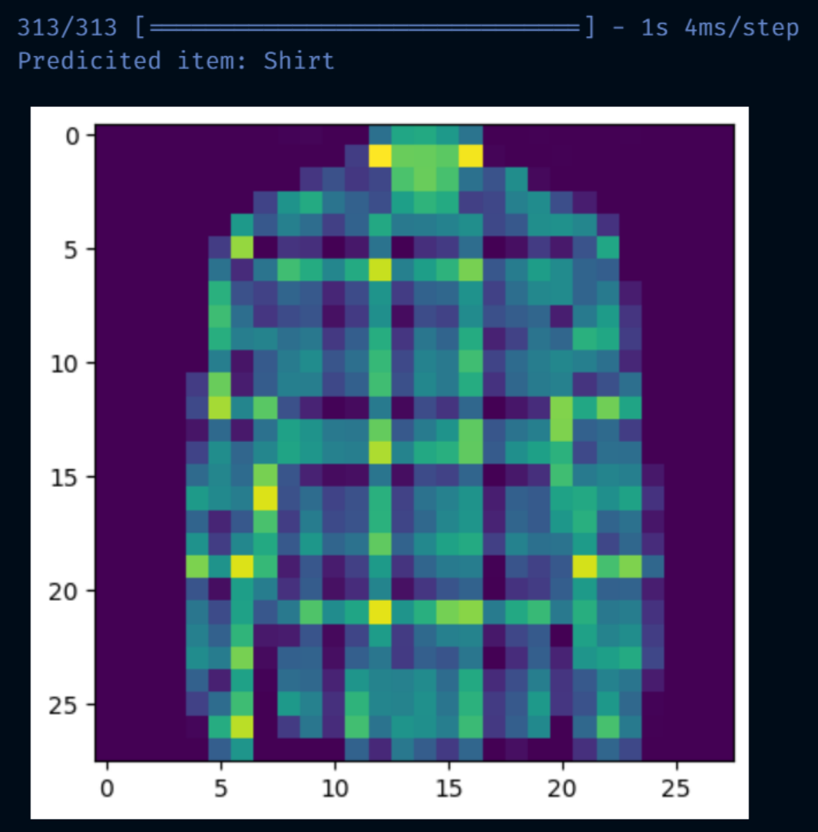
MNIST Fashion
Engaging with the classic MNIST fashion dataset, I embarked on a foundational journey into the realm of neural network training. While not extravagant, it's a valuable learning experience that sheds light on the inner workings of neural networks and the art of self-design in the world of data science.
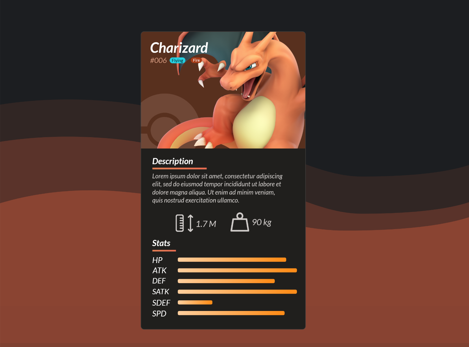
Pokemon Datacard
One of my favorite projects yet! Crafted using front-end web tools, I've harnessed an API to bring Pokémon data to life. By standardizing values with some essential algebra and employing HTML bar elements, I've transformed information this into an intuitive and visually engaging data card.
Animated Data Card
Elevating the concept of data cards to the next level, this project blends graphic design with motion design using Premiere Pro. A striking data card featuring a primary KPI, with smoothly animated bars that add an extra layer of visual appeal and interactivity to really treat the viewer to something special.
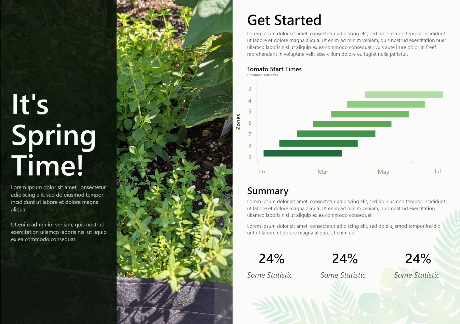
Spring Report
Bringing a modern twist to gardening guides, this report focuses on cultivating a particular plant and the ideal timing for your spring garden. Explore a stylish booklet presenting insightful data on crop initiation and related key performance indicators (KPIs). It's a design experiment that seamlessly blends aesthetics with practicality.
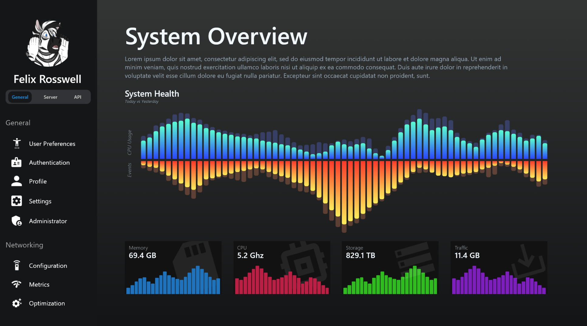
System Report
Drawing inspiration from web admin dashboards, this project delivers a sleek and dynamic summary of a system. With a captivating dark mode and a unique, visually appealing bar chart showcasing four essential data attributes, it elevates the concept of a simple admin panel summary into an aesthetic masterpiece.
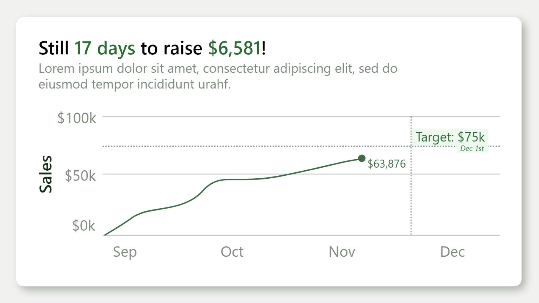
Raise Data Card
An exquisite data card design with a goal-driven focus. It not only illustrates your aspirations but also tracks your progress, offering a clear view of your journey. The crosshair goals, initially a daring choice, blend seamlessly with the card's context, adding an extra layer of aesthetic and informative value.
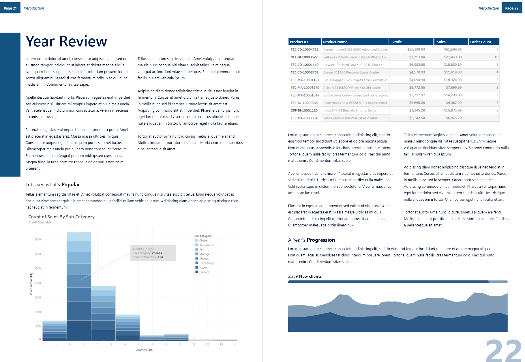
Annual Report
A stunning, modern annual report design that mirrors the professional aesthetics of a corporate business report. This project presents an array of carefully arranged components, prioritizing data charts over images or figures. It's a prime example of elegant design and functionality harmoniously combined.
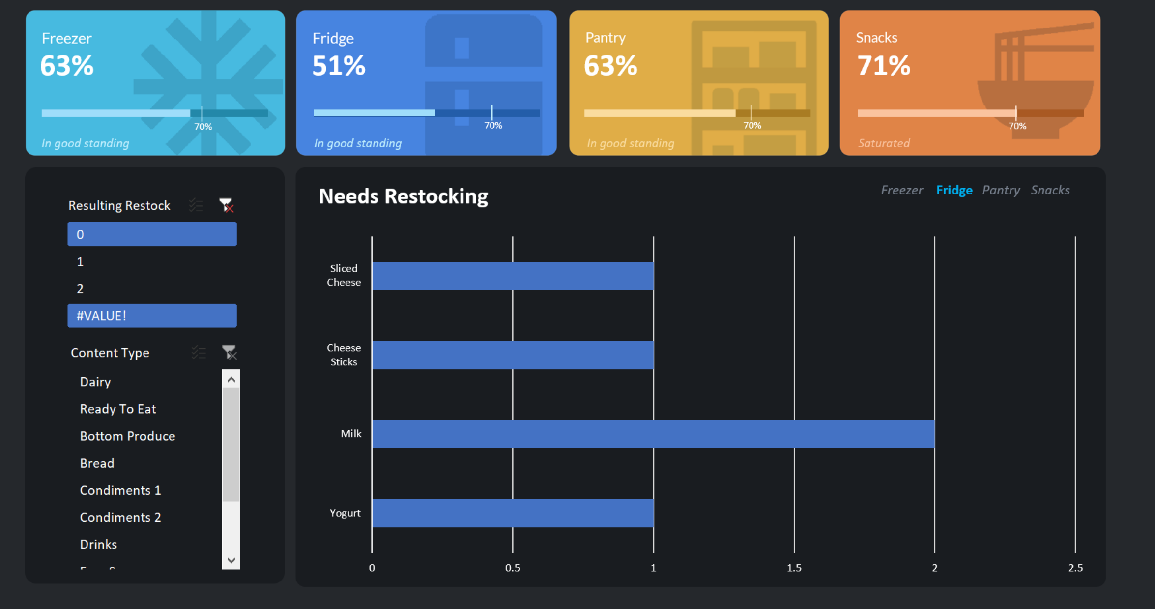
Inventory Dashboard
Unlock the magic of kitchen organization with this comprehensive home inventory system. Not only does it provide a real-time overview of your kitchen stock, but it also goes the extra mile by generating an automatic shopping list to ensure you're always well-stocked and prepared. It's the ultimate kitchen companion.
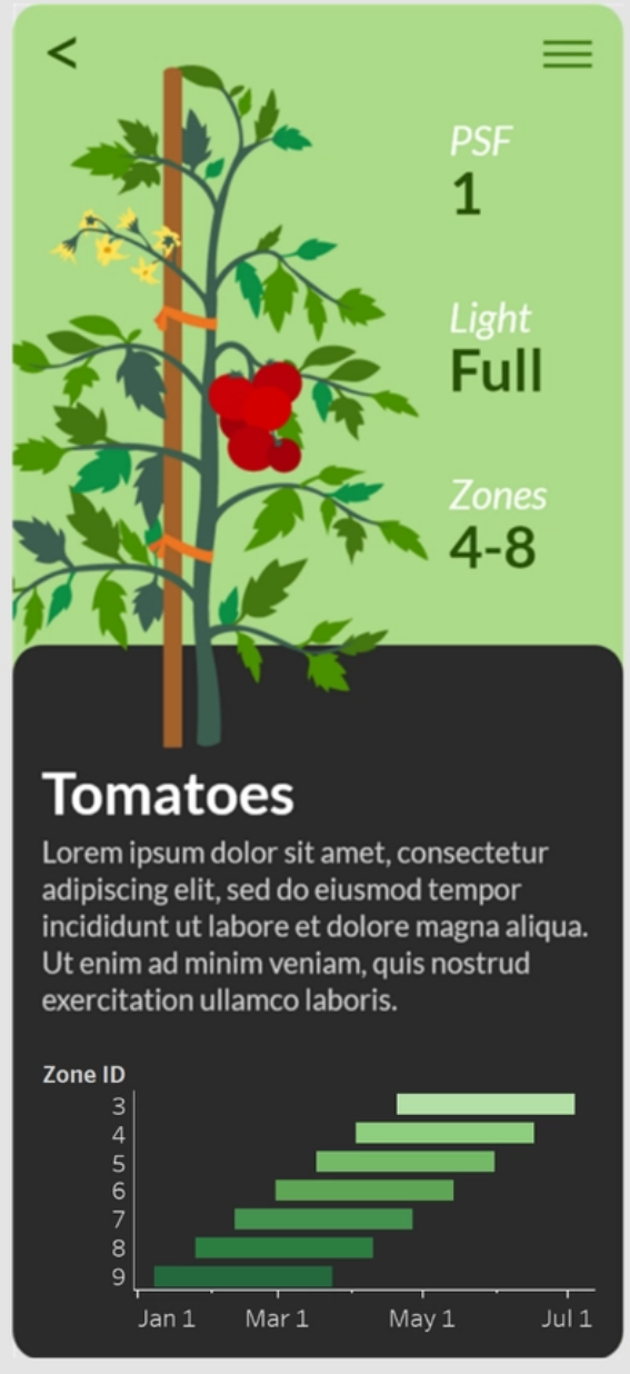
Tomato Data Card
A vertical data card showcasing essential metrics and insights for growing a specific plant, the tomato. Imagine a world where gardening guides are as straightforward and informative as this card, offering direct and to-the-point advice, eliminating unnecessary fluff. The same principle could apply to recipe guides, simplifying our pursuit of knowledge.
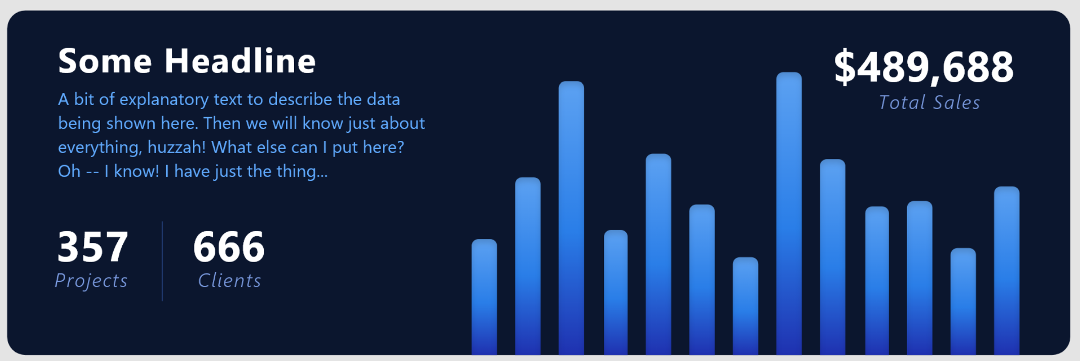
Wide Data Card
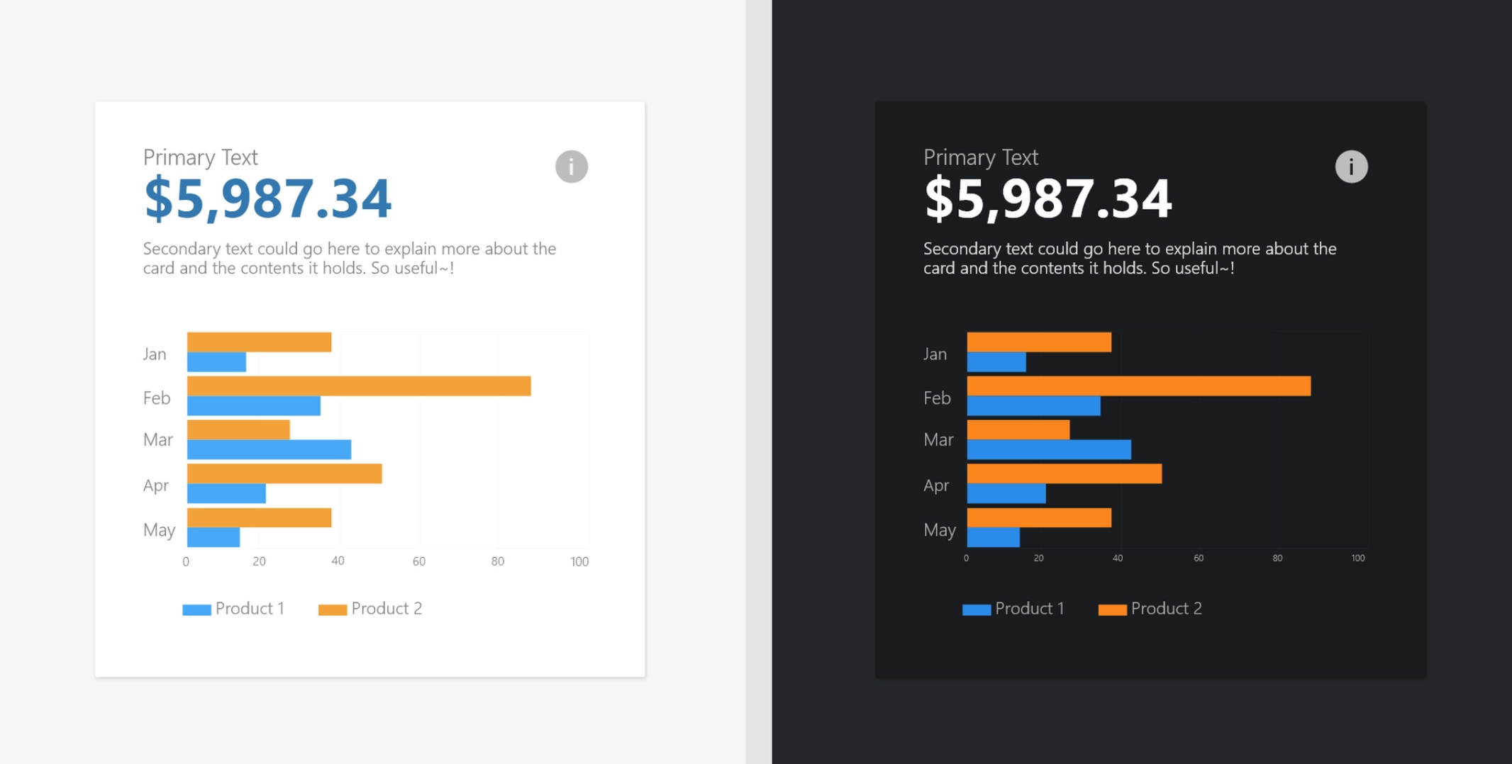
A wide data card that masterfully displays a time trend along with other pertinent information, harmonizing form and function to deliver a pleasing and intuitive experience. It's a visual showcase of how data presentation can be both informative and visually appealing.
My Ultimate Passion
I specialize in the unique convergence of data analytics, user interfaces, and graphic design to craft harmonic data-driven insights that are not just informative but also intuitive and visually compelling. For me, data is not just about numbers; it's a resource to uncover the truth and present it in a way that's intuitive, easy to understand, and transparent in its conclusions.
My purpose is to empower individuals and businesses alike with the ability to make data-driven decisions. Whether it's aiding individuals in overcoming everyday challenges or delivering valuable insights to businesses, I’m dedicated to providing guidance that leads to more successful outcomes. I find immense satisfaction in making a positive impact in the world since knowledge isn’t power until it’s applied.
Education
-
Business Administration - Associate's
Manchester Community College: 2013 - 2016
Acquired a core understanding of business functions like accounting & finance, marketing, leadership & management, and other aspects to help any business functioning.
-
Computer Programming - Associate's
Advanced Technology College: 2020 - 2021
Developed a foundational understanding of object oriented programming practices, semantic code, and algorithmic processes. Primary languages Python, C#, and various web development languages.
-
Database Technology - Associate's
Advanced Technology College: Current - 2023
Developed a foundational understanding of object oriented programming practices, semantic code, and algorithmic processes. Primary languages Python, C#, and various web development languages.
Microsoft Master Specialist
Tableau Desktop Specialist
Google Data Analytics
Right Tools for the Job
Data analytics, web development, and design each demand you to learn multiple programs in order to create something comprehensive. However, utilizing a combination of programs from each of these programs allows me to make use of the strengths, weaknesses, and capabilities of each to make any project a success!
There's a lot of information in the world to be handled, but knowing these empowers me to make sense of it all. Plus, I have much more to look forward to and learn over time.
Engineering
Analytics
Design
See What I'm Up To!
Send an email to [email protected] or take a look at the communities I'm involved in to see what I'm up to. My current main focus is a mix of graphic and motion design, but I play with advanced math and analytics in Python to take on greater data challenges.